


Table of Contents
- 1. Why Search "Change Font Without Plugin"?
- 2. 🚫 A Red Line for Beginners: Never Edit Parent Theme Files Directly
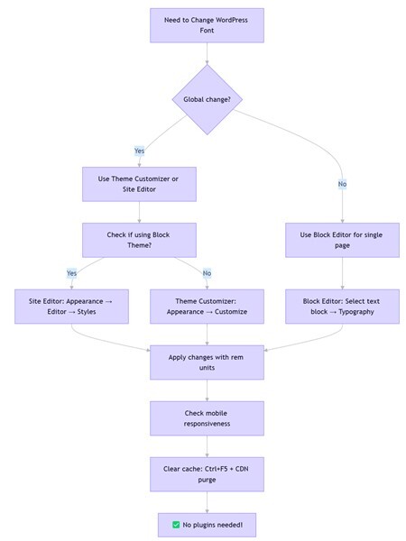
- 3. Method 1: Theme Customizer – Best for Global Adjustments (Beginner‑Friendly)
- 4. Method 2: Block Editor – Quick Fixes for Individual Posts/Pages
- 5. Method 3: Site Editor (Full Site Editing) – The Ultimate Tool for Block Themes
- 6. Method 4: Custom CSS – The Most Flexible Precision Control
- 7. Method 5: Child Theme – The Permanent, Update‑Proof Solution
- 8. Method Comparison: Which One Fits Your Needs?
- 9. Troubleshooting Guide: Common Issues & Solutions
- 10. Conclusion: Lightweight Management Starts with "No Plugins"
Why Search "Change Font Without Plugin"?
I learned this lesson the hard way when I first started with WordPress. Wanting to make body text slightly larger, I installed a popular font plugin—only to watch my site's load time jump, plus occasional backend errors. That's when it hit me: using a plugin for a simple style tweak is like using a sledgehammer to crack a nut.
When users search for "how to change wordpress font size without plugin," they're expressing three underlying concerns:
- Performance anxiety: Plugins add extra HTTP requests and database queries. Based on performance testing data, each plugin can add noticeable load time—a dedicated font plugin might load 50KB of CSS and JavaScript when all you need is a single line of code.
- Security concerns: Third‑party plugins can harbor vulnerabilities, especially those that haven't been updated recently.
- Added hassle: Installing a plugin requires three steps: install → activate → configure. Native solutions take one or two steps at most.
So when you search "without plugin," you're really looking for a lightweight, secure, dependency‑free solution. The good news? WordPress provides native solutions for this exact need.
🚫 A Red Line for Beginners: Never Edit Parent Theme Files Directly
Before we dive into the solutions, there's one thing you must never do: directly edit your parent theme's core files (like style.css or functions.php) via Appearance → Theme File Editor or FTP.
Why this is dangerous:
- When you update your theme (for security or new features), all your changes will be 100% overwritten—gone forever. This is a common complaint in WordPress support forums.
- If you make a syntax error, you can easily crash your site (white screen of death).
Safe alternatives:
All the methods below (Customizer, Block Editor, Site Editor, Custom CSS, Child Theme) store your changes safely, either in the database or in a child theme, so they survive theme updates. Never touch the parent theme files.
Method 1: Theme Customizer – Best for Global Adjustments (Beginner‑Friendly) Zero code
Quick Verdict: Access your theme's built‑in typography controls in minutes—no coding required.
If you're using mainstream themes like Astra, GeneratePress, or OceanWP, you probably won't need to touch code. Based on theme data, the vast majority of modern themes include typography controls in the Customizer.
Step‑by‑Step:
- Go to Appearance → Customize.
- Look for "Typography" or "Fonts" (the icon is often a capital T).
- You'll find settings for body text, headings (H1–H6), menus, widgets, and more.
- Adjust the slider or enter values (e.g.,
16px) with real‑time preview. - Click Publish.
Pros:
✅ Zero code, fully visual.
✅ Changes are saved as theme modifications via the Customizer API and stored in the database—safe from theme updates.
✅ Many themes include responsive controls for desktop, tablet, and mobile.
Cons:
❌ Only available if your theme supports it.
❌ For block themes, use the Site Editor instead (see Method 3).
My Experience: I once helped a client using GeneratePress who felt the body text was too small. In the Customizer, I found the "Body" option and adjusted it from 16px to 17px. Client approved on the spot. Total time: under 30 seconds, no code involved.
Method 2: Block Editor – Quick Fixes for Individual Posts/Pages
Quick Verdict: Perfect for tweaking a single paragraph or heading without affecting the rest of your site.
When you need to adjust text in just one article—like enlarging a pull quote or highlighting a product price—the Block Editor (Gutenberg) is your go‑to tool.
Step‑by‑Step:
- Open the post or page you want to edit.
- Click on the text block you wish to modify (paragraph, heading, list, etc.). Make sure you select the entire block (click its border), not just the text inside.
- In the right‑side block settings panel, find the Typography section.
- You can:
- Choose from preset sizes (Small, Medium, Large, Extra Large).
- Click custom size and enter values inpx,em, orrem(e.g.,1.2rem). - Changes are visible instantly. Save when done.
Pros:
✅ Precise control over individual blocks.
✅ Fully visual, no guesswork.
Cons:
❌ Only affects the current page/post—can't unify your entire site.
Best For: Highlighting a key sentence on your "About" page or making price tags stand out in a product description.
For Classic Editor Users
If you still use the Classic Editor (with the Classic Editor plugin), you can also adjust font size without plugins:
1. Edit a post/page.
2. Select the text you want to change.
3. In the toolbar, find the "Font Size" dropdown (usually shows "Paragraph" by default).
4. Choose a size (e.g., 18px) or click "Custom size" to enter your own value.
5. Update the post.
Method 3: Site Editor (Full Site Editing) – The Ultimate Tool for Block Themes
Quick Verdict: For modern block themes, this is the most powerful native solution—treat your entire site like a canvas.
The Site Editor, now a standard feature in WordPress (requires WordPress 5.9+ and a block theme like Twenty Twenty‑Four, Kadence, or any theme that supports Full Site Editing), lets you edit global styles just as intuitively as editing a page.
Step‑by‑Step:
- Go to Appearance → Editor.
- Click the Styles icon (a half‑black, half‑white circle) in the top‑left.
- Click the pencil icon to enter edit mode, then select Typography.
- You can adjust:
- Text: Corresponds to body content.
- Headings: Expand to set sizes for H1 through H6 individually.
- Links and Buttons if needed. - Click the unit (px, em, rem, %) next to the size field to switch units.
- Preview changes in real time—use the responsive icons at the bottom to switch between desktop, tablet, and mobile views.
- Click Save to apply globally.
Pros:
✅ Global application with built‑in responsive preview.
✅ Changes are stored in the WordPress database as Global Styles—update‑proof and separate from theme files.
✅ Ideal for those embracing the future of WordPress theming.
Cons:
❌ Only works with block themes (requires WordPress 5.9+).
❌ Global style changes won't affect blocks where you've manually set font sizes—those need individual adjustment.
My Testing: On a test site using Twenty Twenty‑Four, I wanted to reduce all H2 headings from 2.5rem to 2.2rem. A quick edit in the Site Editor, and every H2 across the entire site—including older posts—updated automatically. Seamless.
Method 4: Custom CSS – The Most Flexible Precision Control
Quick Verdict: When other methods fall short, CSS gives you unlimited control—and it's easier than you think.
If your theme lacks typography options, you're not using a block theme, or you need highly specific tweaks (like changing font size only in a particular category), CSS is your ultimate solution. Don't be intimidated—it's mostly copy‑paste with a few number changes.
Step‑by‑Step:
- Go to Appearance → Customize.
- Scroll to the bottom and click Additional CSS.
- Paste the code below (adjust values as needed)—preview on the right.
- Click Publish.
How to Find the Right CSS Selector
- Right‑click the text you want to modify and select Inspect (or press F12).
- In the developer tools, you'll see the HTML structure and a Styles panel on the right.
- In Chrome DevTools, you can right‑click the element in the HTML panel, select Copy → Copy selector to get an exact selector (e.g.,
.entry-content > .post-123 > p). - Use that class in your CSS, e.g.,
.entry-title { font-size: 24px; }. - You can also test your selector in the Styles panel by temporarily adding a CSS rule to ensure it targets the right element.
High‑Frequency Code Snippets for Specific Scenarios
/* Global body text */
body {
font-size: 16px;
line-height: 1.7;
}

/* All H2 headings */
h2 {
font-size: 28px;
}

/* Single post content only (replace 123 with your post ID) */
.postid-123 .entry-content p {
font-size: 17px;
}

/* Sidebar widgets */
.widget {
font-size: 14px;
}
.widget-title {
font-size: 18px;
}

/* Footer copyright */
.site-footer {
font-size: 13px;
}

/* Navigation menu */
.main-navigation a {
font-size: 15px;
}

/* Category/archive pages */
.category .entry-title {
font-size: 22px;
}

/* Responsive design – three common breakpoints */
/* Desktop (above 1024px) */
@media (min-width: 1024px) {
body { font-size: 16px; }
h1 { font-size: 36px; }
}
/* Tablet (768px–1024px) */
@media (min-width: 768px) and (max-width: 1024px) {
body { font-size: 15.5px; }
h1 { font-size: 32px; }
}
/* Mobile (below 768px) */
@media (max-width: 768px) {
body { font-size: 15px; }
h1 { font-size: 28px; }
}
Pros:
✅ Can target absolutely any element.
✅ Full responsive control with media queries.
✅ Changes stored in the database via the Customizer API—safe from theme updates.
Cons:
❌ Requires basic CSS knowledge, though copy‑paste covers 90% of needs.
Pro Tip: If your changes don't appear, the theme's default styles might have higher specificity. Instead of immediately using !important, try to write a more specific selector (e.g., .entry-content p instead of just p). Reserve !important as a last resort, as it can make future overrides harder.
Method 5: Child Theme – The Permanent, Update‑Proof Solution
Quick Verdict: For long‑term site management and deep customization, a child theme is the ultimate insurance—your changes will never be lost during parent theme updates.
A child theme inherits all the functionality and styling of its parent, but any modifications you make in the child theme remain untouched when the parent updates. This is the professional way to customize WordPress. Child themes add negligible performance overhead (measured in milliseconds), while font plugins can increase load time by over 2 seconds in some cases according to performance benchmarks—making child themes the clear winner for both stability and speed.
Step‑by‑Step:
- Install a child theme – Most popular themes (Astra, GeneratePress, Kadence) provide official child theme packages you can upload and activate directly from your dashboard. No coding required.
- After activation, go to Appearance → Theme File Editor.
- On the right, select the child theme's
style.cssfile. - Add your custom CSS at the bottom (the same snippets from Method 4 work perfectly).
- Click Update File.
For deeper customization, you can also edit the child theme's functions.php (e.g., to enqueue custom fonts), but for simple font size changes, style.css is enough.
Pros:
✅ 100% update‑proof – Parent theme updates won't touch your child theme.
✅ Organizes all your customizations in one place.
✅ Industry best practice for any serious WordPress site.
✅ Near‑zero performance impact compared to plugins.
Cons:
❌ Slightly more setup than the other methods, but still straightforward.
❌ Requires a child theme to exist (usually provided by the theme developer).
My Experience: I maintain several client sites using child themes. After a major theme update, I've never had to re‑apply font size tweaks—they just keep working. Once you adopt child themes, direct file editing becomes unnecessary.
Method Comparison: Which One Fits Your Needs?
| Method | Best For | Difficulty | Scope | Update‑Proof | Responsive Support |
|---|---|---|---|---|---|
| 🎯 Theme Customizer | Beginners, global tweaks | ⭐ Minimal | Global | ✅ Yes | Theme‑dependent |
| ✍️ Block Editor | Single posts/pages | ⭐ Minimal | Per page/post | ✅ Yes | Manual per device |
| 🖥️ Site Editor | Block theme users | ⭐ Easy | Global | ✅ Yes | Built‑in toggle |
| 💻 Custom CSS | Maximum flexibility | ⭐⭐ Basic CSS | Precision | ✅ Yes | Custom media queries |
| 👶 Child Theme | Long‑term stability | ⭐⭐ Moderate | Global | ✅✅ 100% safe | Same as parent/CSS |
Troubleshooting Guide: Common Issues & Solutions
Q1: I followed the steps, but nothing changed on my site. Why?
Most Likely: Caching. Based on support experience, the majority of "font not updating" issues are due to browser cache.
- Browser hard refresh: Press Ctrl+F5 (Windows) or Cmd+Shift+R (Mac).
- WordPress cache plugins: If you use WP Rocket, W3 Total Cache, etc., clear their caches.
- CDN: If you use Cloudflare or similar, purge the cache there.
If still no change, check CSS specificity:
Your rule might be overridden by a more specific theme rule.
- Example: Theme uses .post-content p { font-size: 16px; } but you wrote p { font-size: 18px; }. The theme's rule wins.
- Solution: Use the same (or more specific) selector. Inspect the element, copy the exact selector (in Chrome DevTools: right‑click element → Copy → Copy selector), and use it (e.g., .entry-content > .post-123 > p).
- If you must, add !important as a last resort: font-size: 18px !important;.
Q2: px, em, or rem—which should I use?
- px: Fixed pixels, precise but ignores user browser settings.
- em: Relative to the parent element—can become confusing with nested elements.
- rem: Relative to the root (html) element. Highly recommended because it respects the user's browser default font size, which is crucial for web accessibility. According to WCAG 2.1 Success Criterion 1.4.4, text must be resizable up to 200% without loss of content or functionality. Using rem allows users with visual impairments to increase font size through browser settings, while px blocks this functionality.
Conclusion: Default to rem. 1rem typically equals 16px (browser default), so 1.2rem equals 19.2px.
Q3: My font looks fine on desktop but breaks on mobile. Help!
Use media queries for mobile‑specific sizes. See the responsive code snippets in Method 4. Always test with the responsive preview in Customizer or Site Editor.
Q4: My theme has no typography options, and I'm scared of code. Any alternatives?
If native methods don't work, consider switching to a more feature‑rich theme. Many free themes like Blocksy or Kadence include robust typography controls. Back up your site first and check how the new theme affects your layout.
Q5: I can't find the font size option in the Block Editor. Where is it?
Two reasons:
1. You haven't selected a text block (paragraph, heading, etc.). Click on the block's border.
2. The option might be hidden. Click the three dots in the block's toolbar, choose "Show more settings", and ensure "Font size" is checked in the Typography section.
Q6: My font changes disappeared after I updated my theme. Why?
You likely edited the parent theme files directly (see the Red Line section). To prevent this, use Customizer, Site Editor, Custom CSS, or a child theme—all of which store changes safely. If you must recover lost changes, you may need to restore from a backup.
Q7: Will changing font size affect my SEO?
Font size itself is not a direct ranking factor, but it influences user experience and Core Web Vitals. Proper font sizing improves readability and reduces bounce rate. Using relative units like rem enhances accessibility, which aligns with Google's emphasis on page experience. Moreover, excessive load time from unnecessary plugins can push sites beyond Google's recommended thresholds for Core Web Vitals, impacting rankings. By using lightweight native methods, you maintain both speed and user experience—both indirect SEO benefits.
Conclusion: Lightweight Management Starts with "No Plugins"
Back to that original search: "how to change wordpress font size without plugin." The answer is simpler than you might think: WordPress itself is more than capable. The WordPress documentation explicitly states that typography adjustments are core features, not plugin requirements.
Whether you prefer beginner‑friendly visual tools or the precision of custom CSS, you can control your typography perfectly without sacrificing performance. Moreover, following WCAG 2.1 accessibility guidelines—using a minimum body text size of 16px and relative units like rem—not only improves user experience but also aligns with Google's ranking factors. Proper font loading and display also impact Core Web Vitals: for instance, overly large fonts can cause unexpected layout shifts (CLS), and render‑blocking plugin CSS can delay Largest Contentful Paint (LCP). By avoiding unnecessary plugins, you keep your site fast and stable.
By avoiding unnecessary plugins, you're not just keeping your site fast—you're also reducing security risks and maintenance overhead.
Next step: Pick one method—maybe start with the Theme Customizer—and adjust one font on your site today. Experience how light and fast your site can feel. Both you and your visitors will benefit from these improvements.
Last updated: March 2026. WordPress versions and features may evolve—always check your current WordPress version for the latest interface changes.